Newsletter Design That Actually Converts
Beyond just an email box — how to craft newsletter sections that fit your footer naturally while actually getting signups from visitors.
March 2026
9 min read
Intermediate
The Footer Is Your Last Chance
Here’s the thing about newsletter signup sections — most sites treat them like an afterthought. They throw a plain email input field at the bottom of the page and hope something happens. But your footer isn’t a trash can for leftover design ideas. It’s actually one of the most valuable real estate sections on your entire website.
Visitors who scroll all the way down have already decided they like your content enough to keep reading. That’s exactly when they’re most likely to subscribe. You’re not convincing them your site exists anymore — you’re capturing their attention at the moment they’re most engaged.
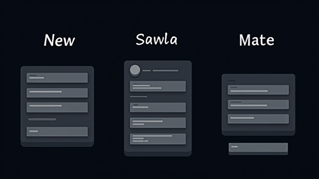
Where It Lives Matters
Most sites get the placement wrong. They either bury the newsletter box below all the sitemap links and social icons, or they make it so small it disappears into the footer noise. Neither approach works.
The best positions we’ve seen? Newsletter sections that come before the secondary navigation. Think about it — people scroll down, see your newsletter offer first, then access the utility links below. You’re not fighting with competing elements. And it doesn’t feel cramped or desperate because there’s still breathing room.
Some designers place it alongside the sitemap (50/50 split) which works great if you’ve got limited footer height. The key is making it feel intentional, not squeezed in.
The Elements That Drive Signups
It’s not just about looking nice — it’s about clarity and confidence.
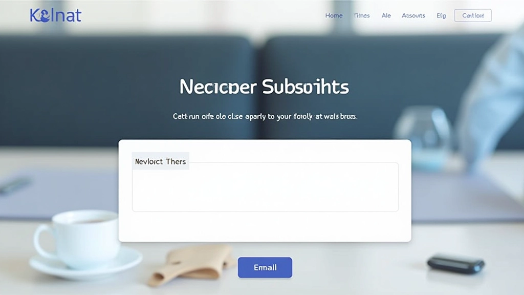
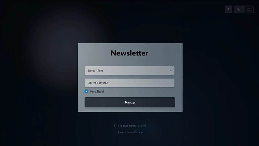
Clear Headline
Skip the generic “Subscribe to our newsletter.” Instead, tell people what they’ll actually get. “Weekly design tips” or “Latest insights on footer strategy” — be specific. People need to know the value before they hand over their email.
Brief Description
One or two sentences max. This isn’t the place for your full pitch. Just explain what you’re sending and how often. “Biweekly insights on design and user experience” tells people exactly what they’re signing up for without overwhelming them.
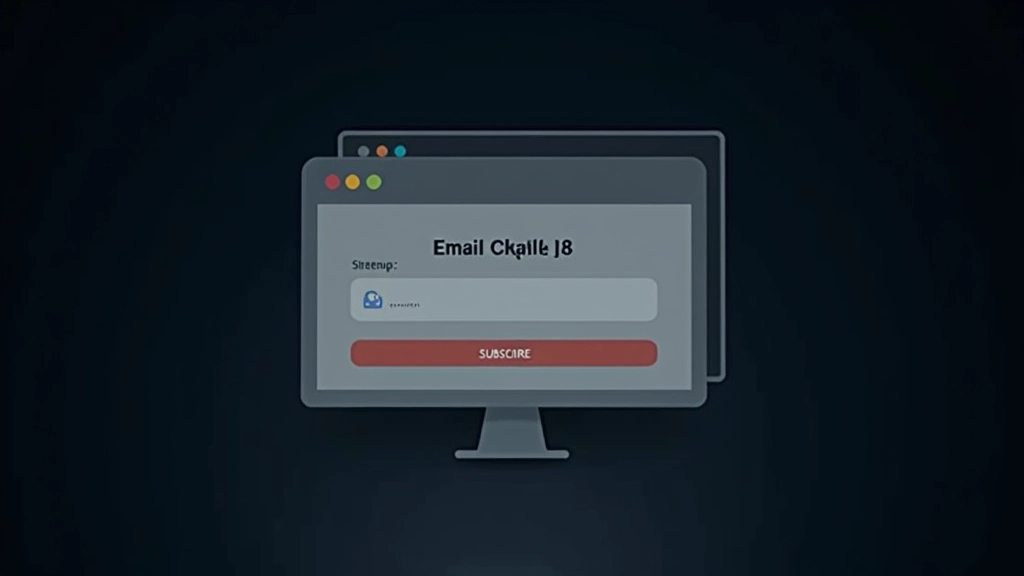
Input Field Clarity
The placeholder text matters more than people think. “Enter your email” works. “[email protected]” works even better. Some sites skip the label entirely and just use placeholder text. It’s risky for accessibility but it does feel more minimal.
Button Treatment
Your button needs to stand out without screaming. We’ve found that a slightly larger button (16-18px type inside) with 12-16px of padding gets clicked more than tiny buttons. “Subscribe” is clearer than “Join” or “Get Started.”
Trust Signal
A small line saying “No spam, ever” or “We respect your privacy” changes conversion rates. It’s not a legal requirement for the footer, but people are hesitant about email. One sentence of reassurance matters.
Color Contrast
Dark footer with light text is standard. But your input field needs to be even lighter so it reads clearly. And the button should use your accent color so it pops. The input field shouldn’t blend into the footer background.
Layout Patterns That Work
You’ve got a few solid options here, and which one you choose depends on your footer structure. We’re not saying one’s objectively better — it’s about what fits your site.
The stacked approach (headline, description, input, button all vertical) works great when you’ve got the width. Full-width footer? Stack everything. This is the clearest pattern and usually gets the highest conversion because everything’s easy to scan.
The horizontal approach (input field and button on the same line) is sleeker and takes up less vertical space. You’ll need at least 400-500px of width to make this work without looking cramped. If your footer’s narrower on mobile, the input needs to expand to full width anyway.
Some sites do a side-by-side with the description on the left (25-30% width) and the input/button on the right. This balances visual weight nicely but only works if you’ve got room.
Tiny Details That Boost Conversions
The difference between 2% conversion and 4% conversion often comes down to micro-interactions. You don’t need animations or flashiness. You need clarity.
Focus states on the input field matter. When someone clicks into it, the border should change color or the background should shift. This gives feedback that something’s happening. A subtle box-shadow works. Don’t make it look broken — just make it clear the field is active.
Button hover states should change the background color or add a slight lift effect. People need to know the button’s clickable. A cursor: pointer helps too, though most browsers handle that automatically.
Success messaging is critical. After submission, replace the form with “Thanks for subscribing” or something similar. Give it a brief moment (2-3 seconds) before clearing it or showing a confirmation. Don’t just make the form disappear silently — that’s confusing.
Spacing and Breathing Room
Here’s something most designers miss — the newsletter section needs clear visual separation from everything else in the footer. You can’t just plop it next to the sitemap with no breathing room.
Add at least 2-3rem of padding around the newsletter area. If it’s in a column by itself, that’s easier. If it’s alongside other footer content, consider a light border or a slightly different background color to distinguish it. Not a harsh border — something subtle.
Between the headline and the input field, 1rem of space works. Between the description and the input, another 1rem. Between the input and the button (if they’re stacked), 0.75rem is enough. Don’t squeeze things together just because it’s a footer.
Making It Feel Natural
The real secret to newsletter conversion isn’t some hidden trick. It’s treating the footer section like it matters, because it does. You’re not cramming in a sales pitch at the bottom of the page — you’re offering real value to people who’ve already engaged with your content.
Make it clear what you’re offering. Give it visual prominence without making it scream. Use proper spacing so it doesn’t feel cramped. Add a small trust signal so people feel safe subscribing. Test different button text and descriptions to see what resonates with your audience.
Most importantly, don’t overthink it. A well-designed newsletter section doesn’t need to be complicated. It just needs to be thoughtful. When you respect your footer as real design space instead of treating it like leftover area, your conversion rates will follow.
Related Articles
Organizing Sitemap Links for Better Navigation
How to group and structure footer links so visitors actually find what they need instead of getting lost in your site map…
Read Article
Social Media Placement: Where Icons Actually Get Clicked
The best positions, sizes, and arrangements for social icons that encourage engagement without overwhelming your footer design…
Read Article
Creating Visual Closure That Feels Natural
Making your footer feel like an intentional conclusion to the page experience, not just a required element at the bottom…
Read ArticleAbout This Article
This article presents design principles and best practices for newsletter subscription sections based on common web design patterns and user experience research. The recommendations are educational and informational in nature. Actual conversion results vary depending on your specific audience, content, design execution, and email service provider. We encourage testing different approaches to find what works best for your particular website and user base. Always ensure your newsletter signup complies with applicable email marketing regulations and privacy laws in your jurisdiction.