Organizing Sitemap Links for Better Navigation
How to group and structure footer links so visitors actually find what they need instead of getting lost in endless categories.

Why Footer Organization Matters
Your footer isn’t just a place to dump links. It’s the last impression visitors get before they leave your site — and sometimes it’s where they’ll find exactly what they need. When your sitemap links are organized well, visitors can find contact information, policies, related content, or ways to connect without hunting around. When they’re messy? People just bounce.
We’re talking about creating a footer structure that actually works for both casual browsers and people on a mission. The difference between a footer that’s just there and one that genuinely helps visitors comes down to thoughtful grouping, clear labels, and visual hierarchy. It’s not complicated — it just requires intention.

The Core Strategy: Group by Purpose
Don’t just list links alphabetically or by how important you think they are. Group them by what visitors are actually looking for. Most sites benefit from 3-5 main categories. You might have Product Links (what you offer), Company Info (who you are), Support Resources (help and documentation), and Legal Stuff (privacy, terms, that kind of thing).
Each group should have a clear header — make it obvious what you’ll find there. “Resources” is better than “Miscellaneous.” “Company” works better than “About Us Links.” The headers are anchor points. When someone scans your footer, those category titles help them navigate instantly. You’ll typically want 3-8 links per category. More than that and it starts feeling overwhelming.
Physical Layout: The 3-Column Standard
Most effective footers use a 3-4 column layout on desktop. Column one might be your logo or brand statement. Columns two, three, and four hold your link groups. This layout works because it’s balanced — not too cramped, not too spread out. On mobile, everything stacks into a single column, so each group becomes its own section.
The spacing matters here. You want roughly 40-60px between columns on desktop. Links within a category should be tighter — maybe 12-16px between lines. This visual difference helps visitors understand the hierarchy: these links belong together, those are separate. Font size should be slightly smaller than body text (around 13-14px works well) but absolutely still readable. You’re not trying to hide these links.

Making Links Actually Scannable
Your category headers should be bold or a different color — something that stands out from the regular link text. This creates an instant visual entry point. Visitors scan headers first, then look at links below. If headers are the same weight as the links, you’ve lost them.
Links should be in a lighter gray than headers but not so light they’re hard to read. Around 70-80% opacity works if you’re using white text on a dark background. Make sure links change appearance on hover — an underline, a color shift, or a slight highlight. This feedback tells visitors “yes, this is clickable.” Without it, they’re not sure if these are actually links.
Pro tip: Keep link length reasonable. If a link text is longer than 25-30 characters, it probably needs rewording. “View Our Privacy Policy” works better than “Click Here to Read the Complete Privacy Policy Documentation.”
Ordering Links Within Categories
Don’t alphabetize. Seriously. Put your most important links first. In a Support category, your Help Center comes before the FAQ comes before Status Updates. In a Products section, your flagship offering comes before secondary products. This is intentional hierarchy.
Some sites put contact information in its own small section near the bottom. Others integrate it into the main footer. There’s no universal rule — what matters is that it’s easy to find. If you’re an e-commerce site, your customer service link should be prominent. If you’re a SaaS company, your documentation and support are probably more important than your blog.
The bottom of your footer sometimes holds secondary links: legal stuff, accessibility statements, cookie preferences. These don’t need to be huge or prominent — people know to look there. But they do need to exist and be findable.

Mobile Considerations and Responsiveness
Your footer should stack into a single column on phones — but don’t just dump everything in order. Consider using expandable sections (collapsible categories) on mobile. Users tap a category header and the links appear below. This keeps the footer from being ridiculously long while still making everything accessible.
Some designers collapse categories automatically on phones under 768px width. Others keep them expanded. Test both approaches — your audience will tell you which works better through engagement patterns. What matters is that footer links aren’t invisible on mobile. A footer that’s collapsed by default but can be expanded is fine. A footer that’s completely hidden is not.
On mobile, tap targets matter. Links should be at least 44x44px (that’s Apple’s recommendation, and it’s good guidance). Make sure links aren’t crammed so tightly that users accidentally tap the wrong one. 16-20px of vertical space between links on mobile is reasonable.

Start Auditing Your Footer Today
Your footer is real estate. Don’t waste it. Look at your current footer and ask: Are my links grouped logically? Can someone find what they need in three seconds? Are my most important links first in each category? Is my mobile footer usable?
Small improvements in footer organization often translate to measurable gains. More people find your support resources. More people complete signups. More people navigate to important pages. It’s not flashy work — nobody’s going to congratulate you for an organized footer — but visitors will appreciate it quietly every time they use it.
Ready to Improve Your Navigation?
Take these principles and audit your own footer this week. Group your links intentionally, order them by importance, and test on mobile. The effort pays off.
Educational Information
This article provides educational guidance on website footer design and information architecture principles. The approaches and recommendations shared here are based on established web design practices and user experience research. Individual results vary depending on your specific audience, website purpose, and business goals. Consider testing these approaches with your own audience and consulting with a professional designer or UX specialist for personalized guidance specific to your website.
Related Articles
Social Media Placement: Where Icons Actually Get Clicked
The best positions, sizes, and arrangements for social icons that encourage engagement without dominating your footer.
Read More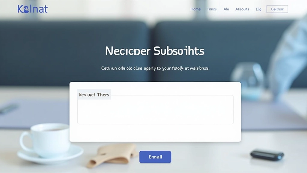
Newsletter Design That Actually Converts
Beyond just an email box — how to craft newsletter sections that fit your footer and encourage sign-ups naturally.
Read More
Creating Visual Closure That Feels Natural
Making your footer feel like an intentional conclusion to the page experience, not just an afterthought tacked on at the end.
Read More