
Organizing Sitemap Links for Better Navigation
How to group and structure footer links so visitors actually find what they need instead of getting lost in a wall of text.
Read ArticleMaking your footer feel like an intentional conclusion to the page experience, not just a dumping ground for links and legal text.

You’ve scrolled through a beautifully designed page. The navigation was intuitive, the content was engaging, and everything felt cohesive. Then you reach the footer and it’s… underwhelming. Random links scattered everywhere. A newsletter signup box that doesn’t match anything else. Social icons crammed into a corner. Sound familiar?
Here’s the thing — most footers aren’t designed. They’re assembled. People dump navigation items, legal requirements, and random calls-to-action into a section without thinking about how it all comes together. But a well-crafted footer isn’t just functional. It’s the final handshake with your visitor. It’s closure.
When you’re designing a footer that actually feels intentional, you’re not adding more elements. You’re organizing what needs to be there in a way that makes sense visually and structurally. Let’s explore how to do that.

Before you start arranging elements, you need a mental model. Think of your footer in three distinct layers, each serving a different purpose. The first layer is utility — navigation links, sitemap information, quick access to important pages. This is practical stuff. The second layer is connection — newsletter signup, social media links, contact information. It’s about continuing the relationship beyond this single page. The third layer is legal and structural — copyright, terms, privacy policy, accessibility statements.
Most footers collapse all three layers into visual chaos. You’ll see a link to “Privacy Policy” right next to a newsletter signup next to a social icon next to a navigation menu. That’s mixing purposes. When you separate these layers visually, even with the same background color, suddenly the footer feels intentional. You’re guiding people through a clear hierarchy.
The key isn’t cramming everything into equal visual weight. It’s recognizing that different sections need different emphasis. Your primary navigation gets prominence. Your secondary links are there but quieter. Your legal stuff is present but doesn’t dominate the visual landscape.


Your footer navigation isn’t the same as your header navigation. The header is about where someone is now and where they might go next. The footer is about what they might’ve missed or what they should know before leaving. This distinction changes how you organize links.
Group links by category or function, not alphabetically. Most sites list services, resources, company information, and legal links in distinct columns. Don’t just throw everything into one massive list. Three to five columns works well for desktop — each column handles a related group of links. On mobile, these stack vertically but maintain their grouping. The spacing between groups matters as much as the links themselves.
Limit each column to 4-7 links. When you exceed that, visitors stop reading. If you’ve got more links, create subcategories or reconsider what actually belongs in the footer. Not every page on your site needs to be accessible from the footer. The footer should highlight the essentials, not replicate your entire information architecture.
Social icons in the footer work best when they’re intentional, not just decorative. Don’t include a social link if you’re not actually active on that platform. If you haven’t posted on Pinterest in two years, that icon is just taking up space and suggesting your brand is inactive there.
Size matters here. Your social icons should be noticeable but not aggressive. Around 24-32 pixels for standard desktop viewing works well. They’re accessible, not demanding. Place them near your other connection points — newsletter signup, contact information — rather than scattering them. When social icons live in one corner and newsletter signup lives somewhere else, you’re not creating connection. You’re creating confusion.
Color them consistently with your brand, but don’t make them the visual anchor of your footer. They’re supporting players. If you’ve got a strong newsletter signup area or prominent contact information, those should draw attention first. Social links are there for people who already want to connect beyond the site.


Your newsletter signup is where the footer actually performs a function. It’s not just informational — it’s where people opt in to continue the relationship. This deserves real design consideration, not just a text input field and a button.
Create a distinct visual container for your newsletter area. This could be a slightly different background color, a subtle border, or just more generous padding. The point is: make it clear this is a separate action from browsing footer links. You’re asking people to do something, not just click around.
Keep the form simple. Email field, submit button, and maybe a single line of context about what they’re signing up for. “Weekly design insights” is better than “Subscribe to our newsletter.” Be specific about the value. And don’t bury the form in tiny text at the bottom of your footer. It deserves breathing room and prominence.
Here’s what separates a designed footer from an assembled one: intentionality. You’re not just listing everything that needs to be there. You’re considering how each element relates to the others and how they guide the eye.
Start with whitespace. Your footer doesn’t need to be packed. In fact, breathing room makes everything feel more intentional. Use padding and gaps to separate your three layers. Let the visual hierarchy emerge naturally from spacing, not from color changes or aggressive styling.
Then consider the visual flow. What do you want people to see first? Usually that’s your primary navigation or your value proposition. Then social/newsletter connection. Then legal requirements. Your eye should move through the footer in a logical sequence. When everything competes for attention equally, nothing wins.
Finally, match your footer’s personality to the rest of the page. If your header uses a particular typographic hierarchy or color treatment, echo it in the footer. You’re creating closure — visual continuity that makes the whole experience feel complete. The footer isn’t a new beginning. It’s the natural conclusion.

This article presents design principles and best practices for footer layouts. While these guidelines work well for most websites, every site’s needs are different. Footer structure, link organization, and visual hierarchy should ultimately serve your specific audience and business goals. Test your footer design with real users to understand what works best for your particular situation.
How to group and structure footer links so visitors actually find what they need instead of getting lost in a wall of text.
Read Article
The best positions, sizes, and arrangements for social icons that encourage engagement without overwhelming your footer design.
Read Article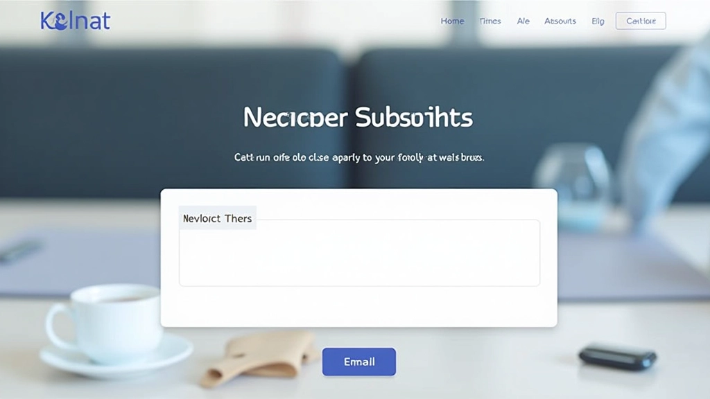
Beyond just an email box — how to craft newsletter sections that fit your footer aesthetic while driving actual subscriptions.
Read Article