
Footer Design & Page Closure Patterns
Learn how strategic footer layouts, organized sitemaps, and thoughtful newsletter design create meaningful page closure experiences that guide users back to discovery.
Footers aren’t an afterthought — they’re the final impression your site makes. Whether it’s organizing sitemap links, placing social icons strategically, or designing newsletter signup areas, we’ll explore patterns that actually work.
Essential Guides
Explore practical approaches to footer architecture and page closure design
Social Media Placement: Where Icons Actually Get Clicked
The best positions, sizes, and arrangements for social icons that encourage engagement without overwhelming your footer design.
6 min
Intermediate
March 2026
Read More
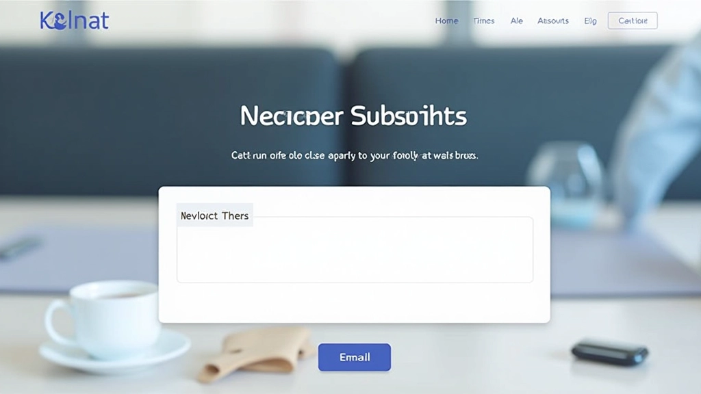
Newsletter Design That Actually Converts
Beyond just an email box — how to craft newsletter sections that fit your footer naturally while actually getting signups from visitors.
9 min
Intermediate
March 2026
Read More

Creating Visual Closure That Feels Natural
Making your footer feel like an intentional conclusion to the page experience, not just a dumping ground for links and legal text.
8 min
Advanced
March 2026
Read More
Core Footer Design Principles
What separates a useful footer from one people scroll past
1
Information Architecture First
Don’t just list everything. Group links into logical categories — Products, Support, Company, Resources. Think about how visitors actually search for things.
2
Hierarchy Matters in Footers Too
Primary navigation gets top placement. Legal links, language switchers, and less critical items go lower. Users should find the important stuff without hunting.
3
Space and Breathing Room
Cramming everything into a narrow column makes footers feel claustrophobic. Multi-column layouts with proper spacing make navigation feel intentional.
4
Visual Consistency With Your Brand
Your footer should feel like part of your site, not an afterthought. Use consistent typography, colors, and spacing that match your overall design system.
Common Footer Layout Patterns
Proven structures that work across different site types and industries
Multi-Column Footer
2-4 columns of organized links with headers. Works well for larger sites with diverse content. Allows visitors to quickly scan for their destination without scrolling horizontally.
Compact Centered Footer
Simple centered layout with minimal text, logo, and links. Best for smaller sites, portfolios, or apps. Creates a clean, intentional page closure without overwhelming.
Newsletter-First Footer
Newsletter signup takes visual priority, with links secondary. Good for content sites that want to build their audience. Must balance conversion goals with navigation needs.
Sitemap-Heavy Footer
Comprehensive link structure with extensive categorization. Common in e-commerce and large corporate sites. Requires careful organization so it doesn’t feel overwhelming.